2024 Internship

Launched Project

Enhance More User Adoption:
PhotoQuest WebApp Redesign

End-to-end product redesign for more intuitive user flow and user experience.

See Final Design

See Final Design

Timeline:
Timeline:

2024.04 - 06

2024.04 - 06

2024.04 - 06

Type:
Type:

Internship Project

Launched Product

Internship Project

Launched Product

Internship Project

Launched Product

My Role:
My Role:

Product Redesign

Prototyping

User Testing

Design Iteration

Product Redesign

Prototyping

User Testing

Design Iteration

Product Redesign

Prototyping

User Testing

Design Iteration

Team:
Team:

2 UX Designers

1 UI Designer

2 Developers

2 UX Designers

1 UI Designer

2 Developers

2 UX Designers

1 UI Designer

2 Developers

Tools:
Tools:

Figma

UserTesting.com

Figma

UserTesting.com

Figma

UserTesting.com

Overview
Overview

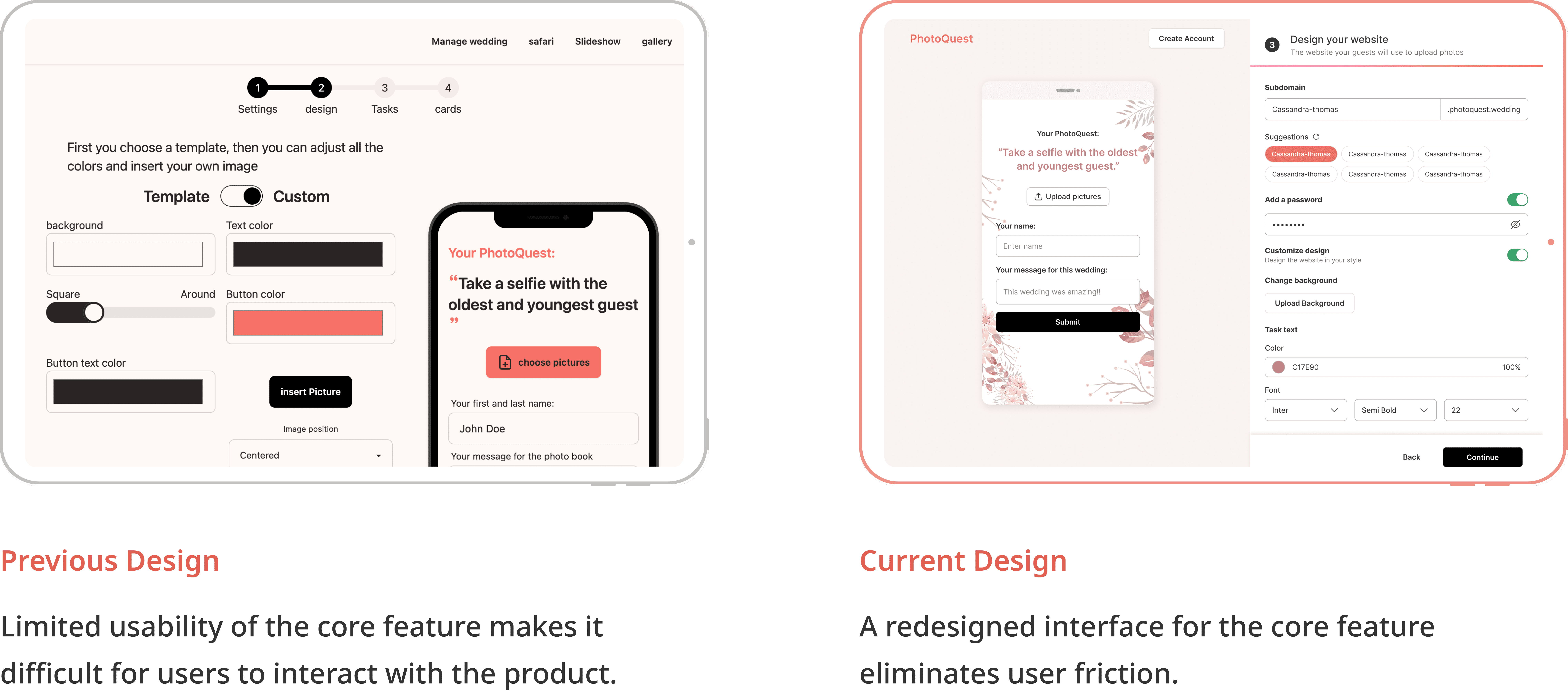
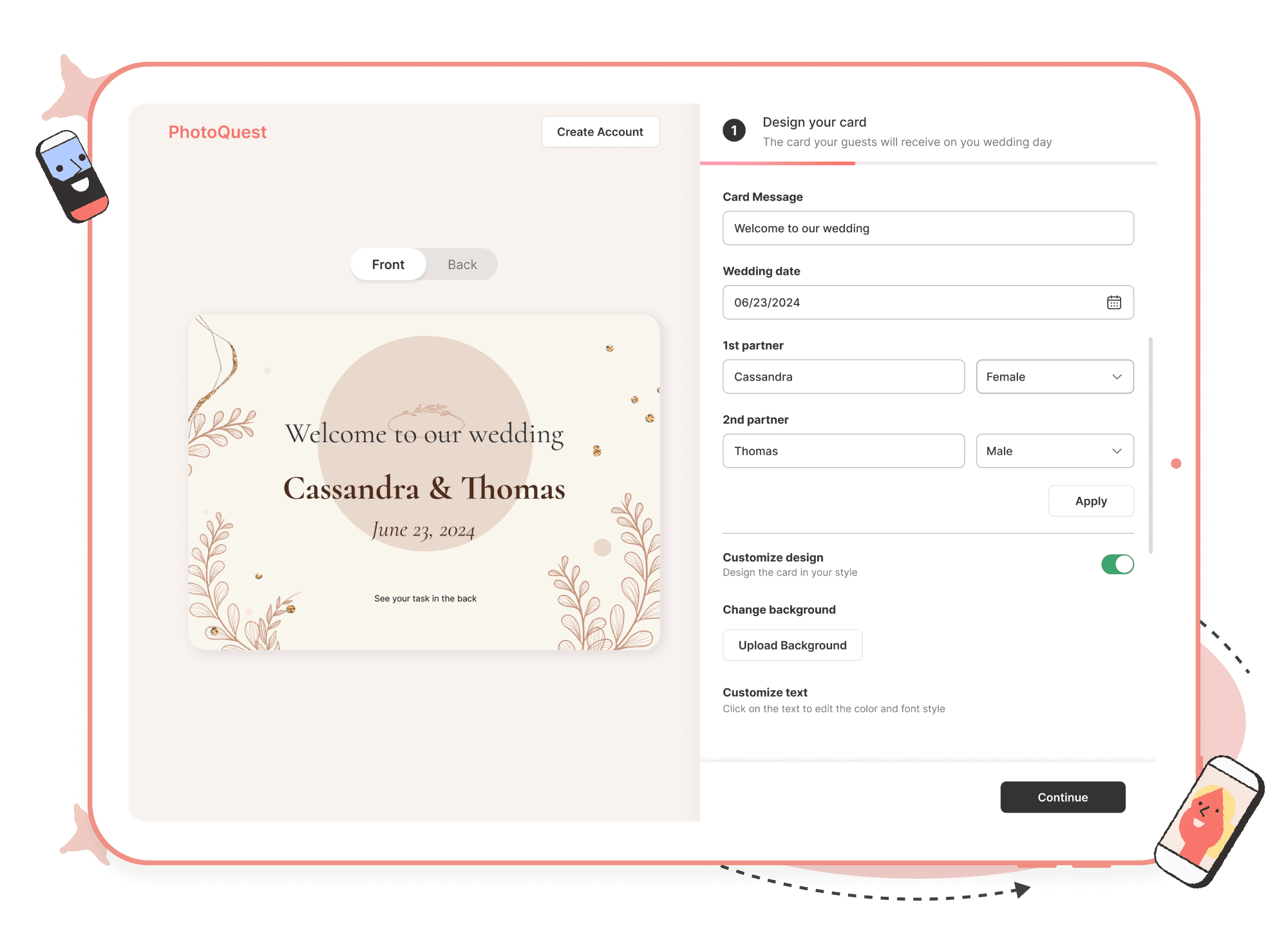
PhotoQuest is a web app designed for wedding couples who have frustration in organizing their guests. In April 2024, PhotoQuest approached our team to revamp the product to address their user adoption challenge. As the UX designer, I focused on enhancing a more intuitive onboarding flow and better user experience.

Going beyond the initial project scope, I also identified and seized another critical opportunity to further optimize user onboarding. Ultimately, we achieved substantial increases in user engagement and platform adoption by 33.5%.

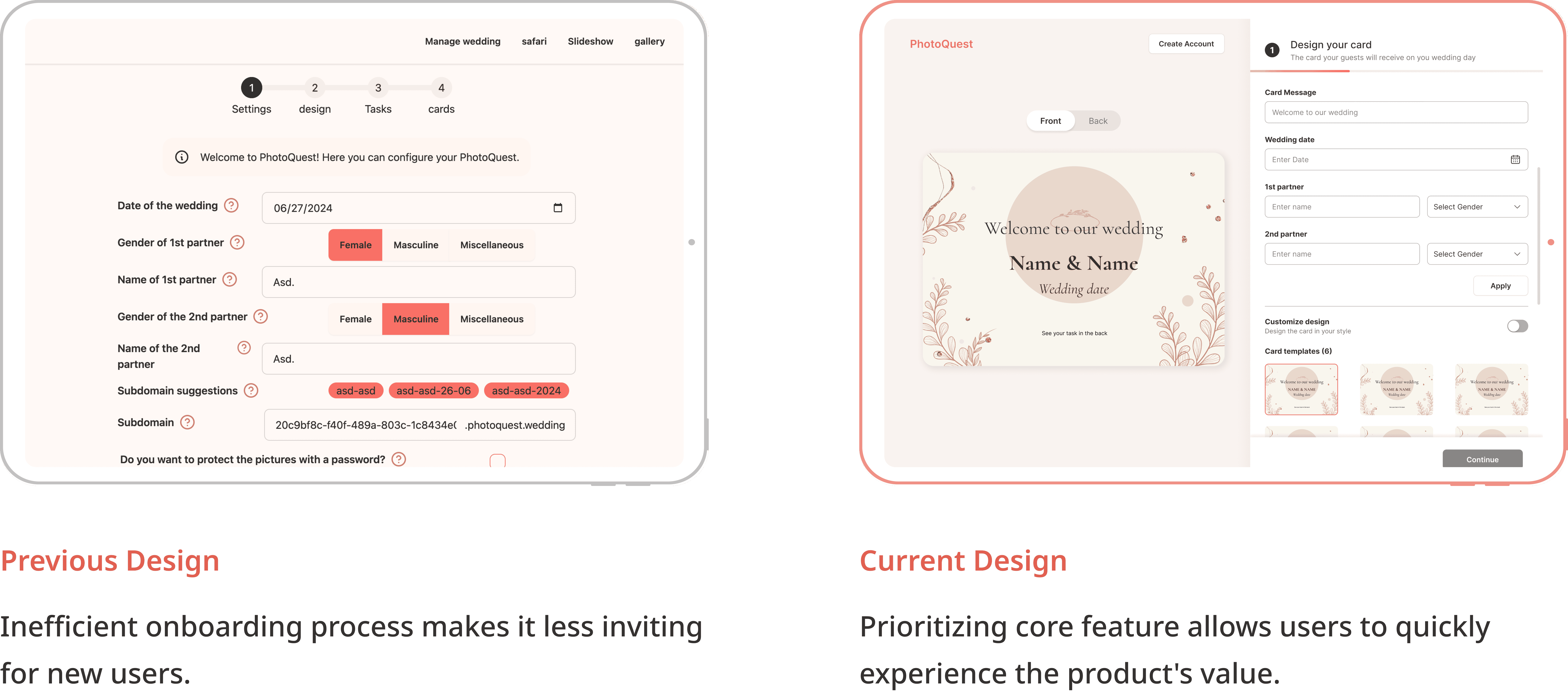
Before & After
Before & After
Impact
Impact
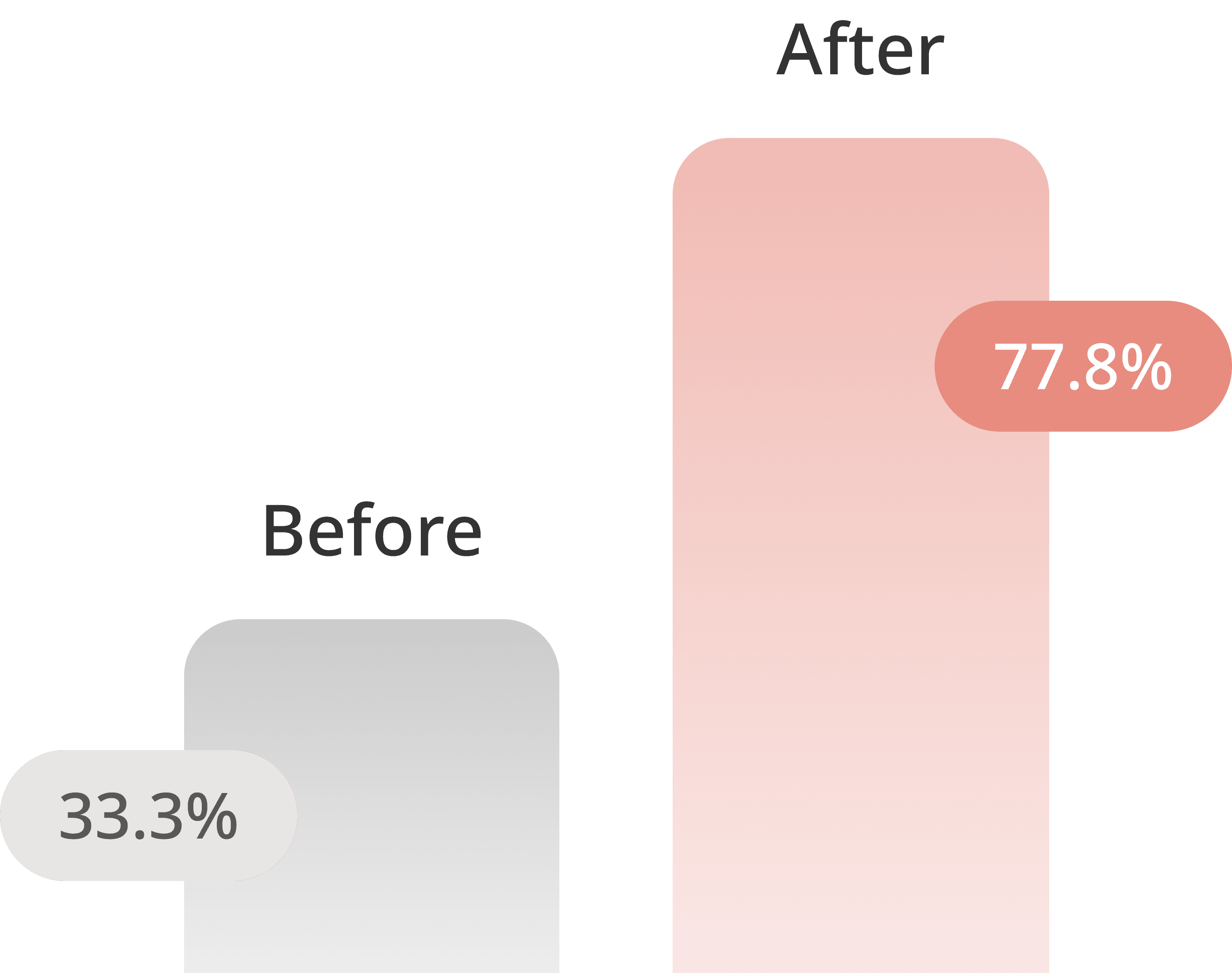
This new design has been shipped, and from the most recent user testing, it achieved a 77.8% task completion rate.

Before:

Before:

Before:

only 3 out of 9 testers progressed to the subscription model.

After:

After:

After:

7 out of 9 users completed onboarding and subscribed to the paid service.

About
About
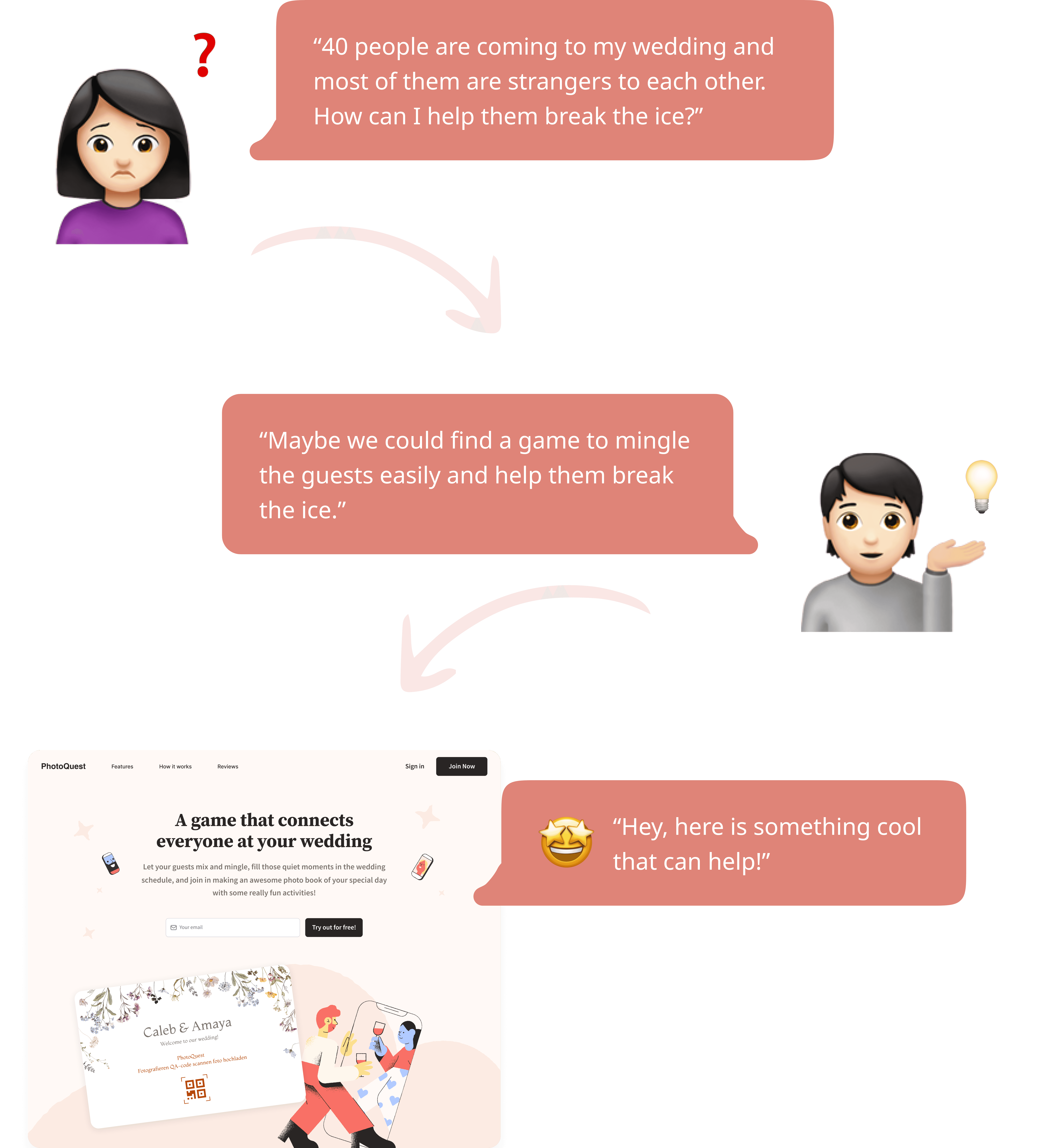
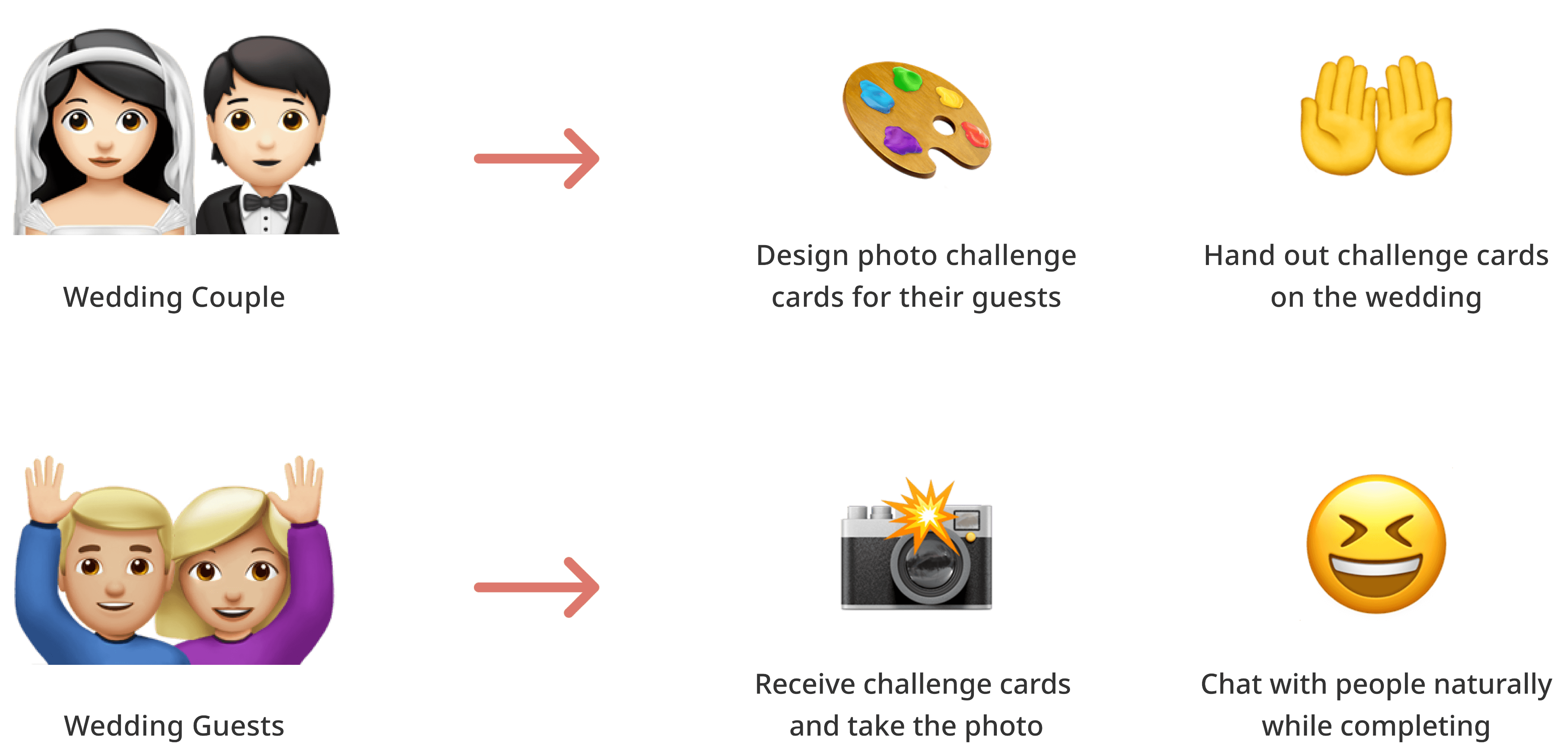
PhotoQuest is an innovative web app designed for many couples to resolve the concerns of making the wedding guests break the ice.
A common frustration for many wedding couples:
A game that mingles wedding guests easily:
Context
Context
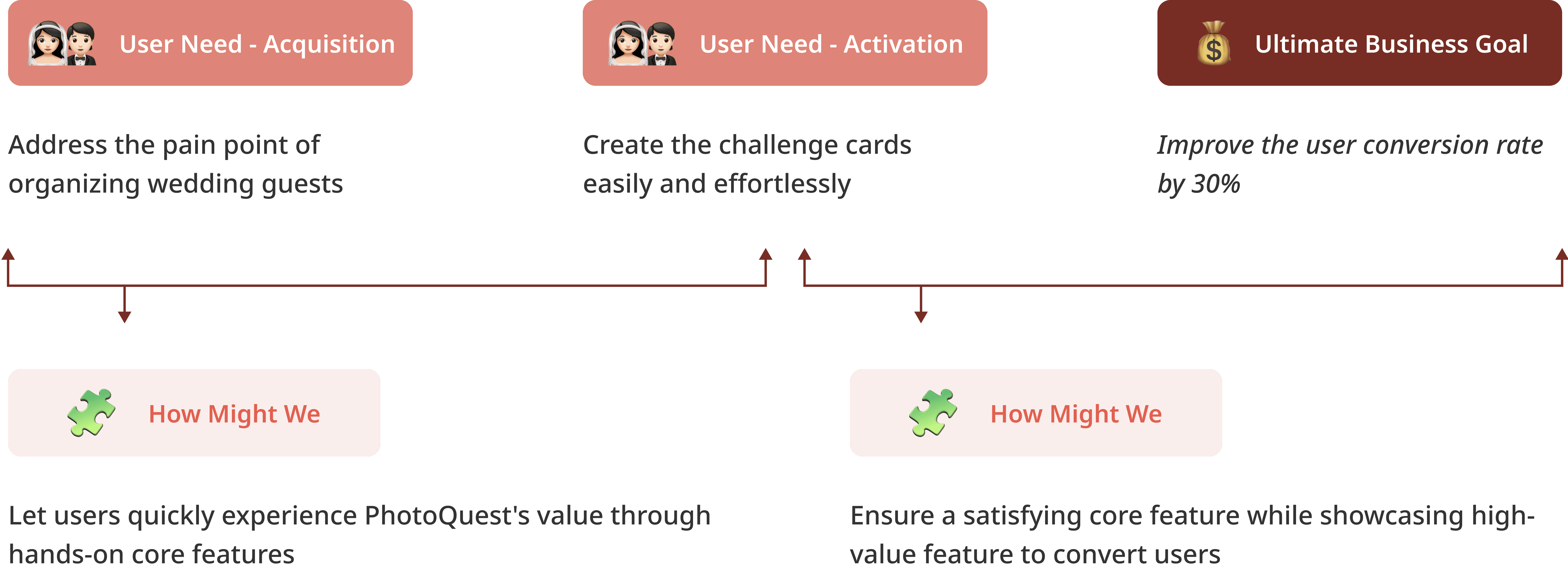
PhotoQuest faces a significant challenge with user adoption, as many users drop off shortly after signing up.

To better help PhotoQuest tackle challenge, I initiated a series of stakeholder interviews with our client to gather more context.

1

1

1

Define the design dirction

2

2

2

Define the user needs and business goal
UX Audit
UX Audit
I then carried out a comprehensive UX audit to identify the problems in the previous design that impeded users from fulfilling their needs.
To identify the issues that need addressing, I carried out a comprehensive UX audit to define the problems in current design.

The UX audit uncovered many issues, so I facilitated a series of feature prioritization sessions with client, considering the timeline and development constraints.

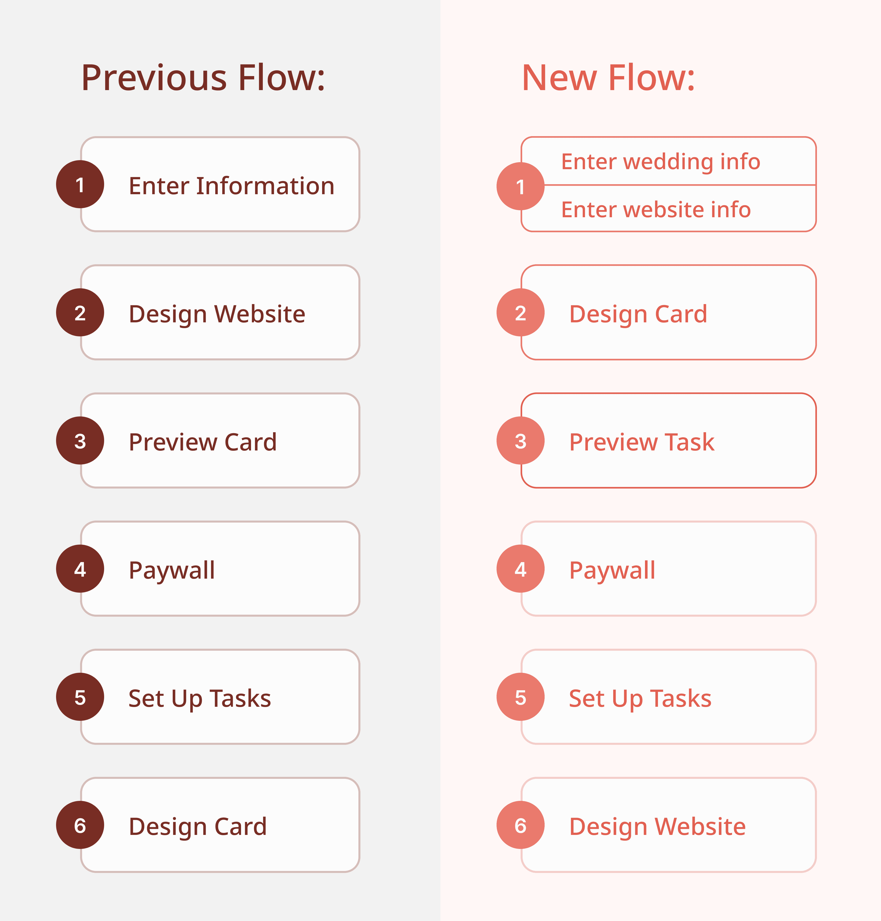
I first mapped the key user flows and identified two critical issues:

Previous User Flow

Previous User Flow

Previous User Flow

PROBLEM 1:

PROBLEM 1:

PROBLEM 1:

The core experience of Design Card is significantly delayed. New users must navigate multiple steps before accessing this core feature, which potentially leads to an increased attrition rates.

PROBLEM 2:

PROBLEM 2:

PROBLEM 2:

The placement of subscription model prior to the core card design feature may hinder conversions, as users who haven't interacted with key experience are less likely to pay for the service.

The placement of subscription model prior to the core card design feature may hinder conversions, as users who haven't interacted with key experience are less likely to pay for the service.

I then conducted a heuristic evaluation and discovered some usability problems:

PROBLEM 1:

PROBLEM 1:

PROBLEM 1:

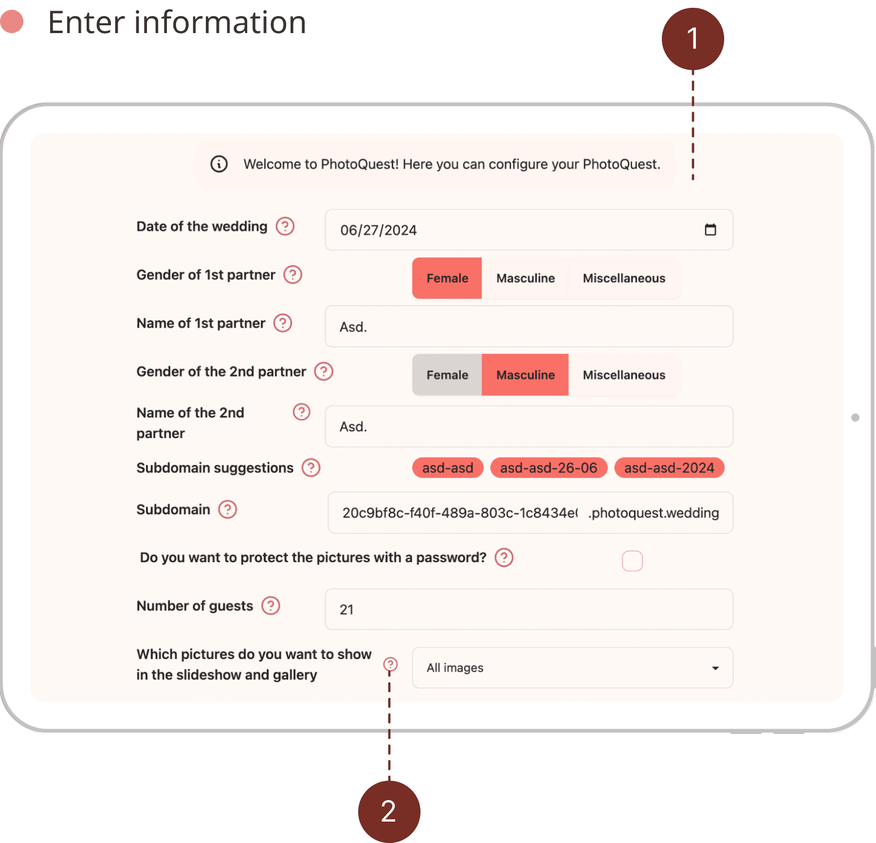
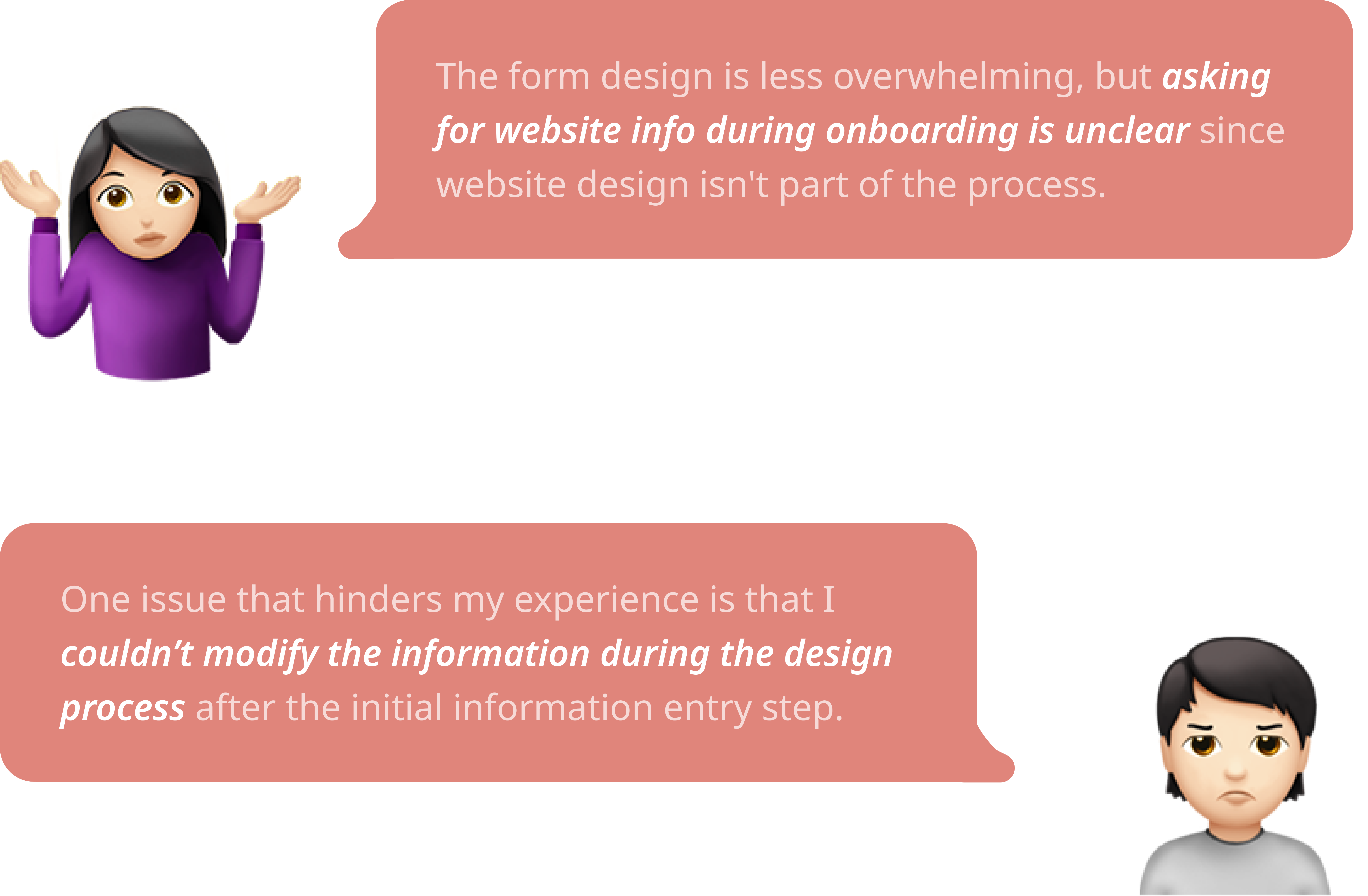
First time users could be overwhelmed by the amount of questions and doubt the relevance of the information.

PROBLEM 2:

PROBLEM 2:

PROBLEM 2:

The inefficient form design leads to the excessive use of explanatory icons and tooltips which cluttered the interface.

PROBLEM 3:

PROBLEM 3:

PROBLEM 3:

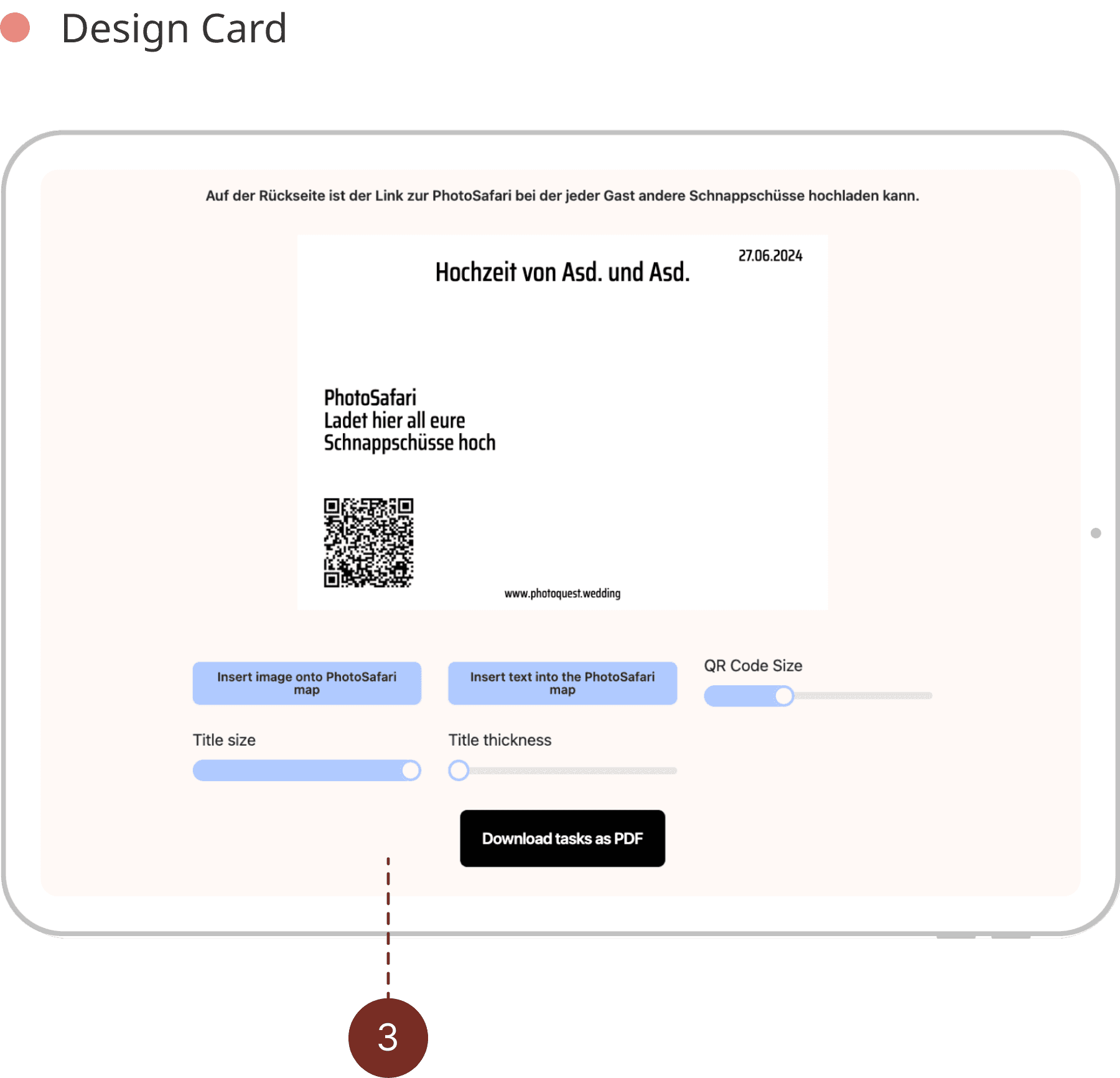
The unintuitive placement of UI elements makes it difficult for users to tell which controls affect which section on the card.

Design Goal
Maintain the core functionalities while
improving the workflow intuitiveness and the feature usability.
Iteration #1
Iteration #1
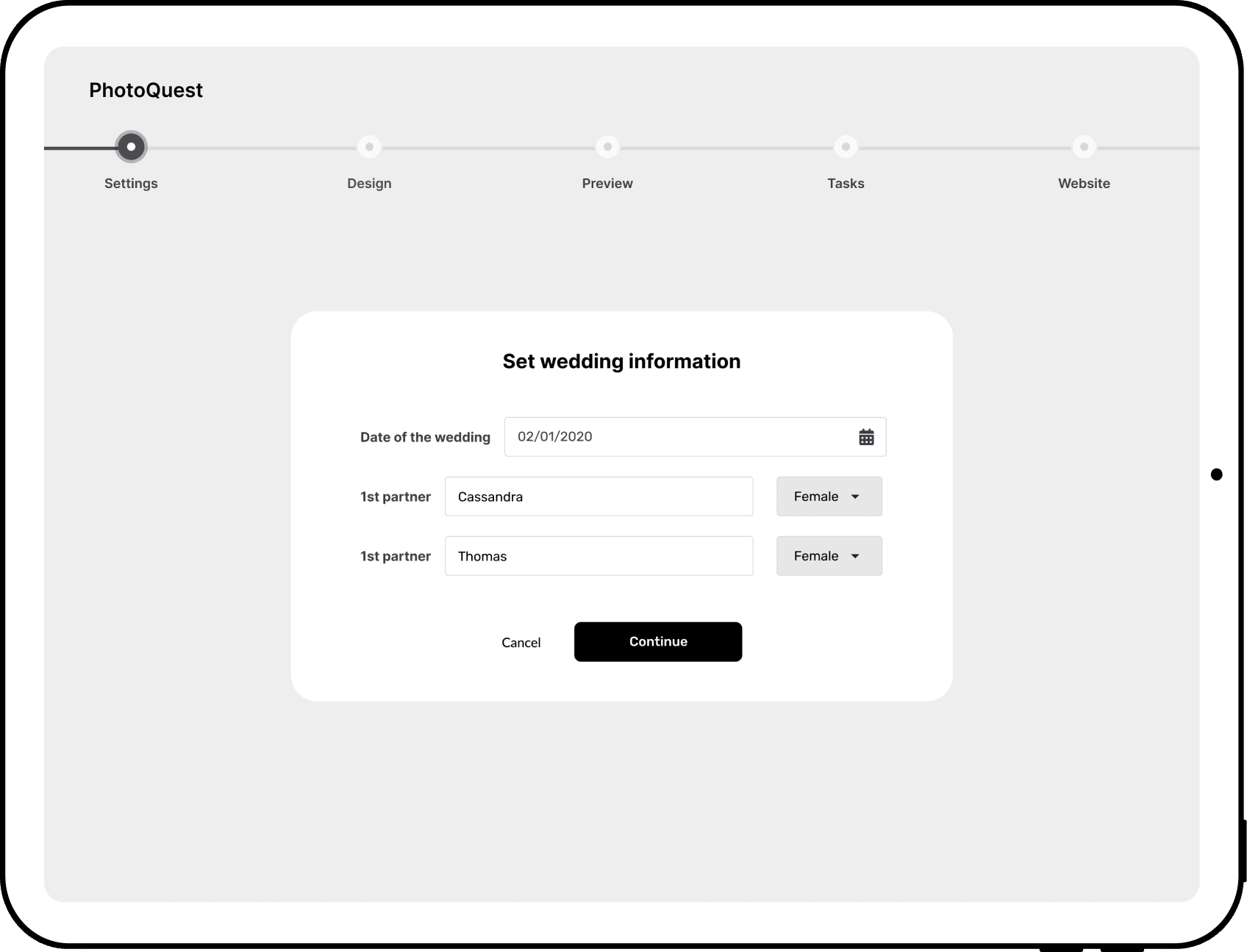
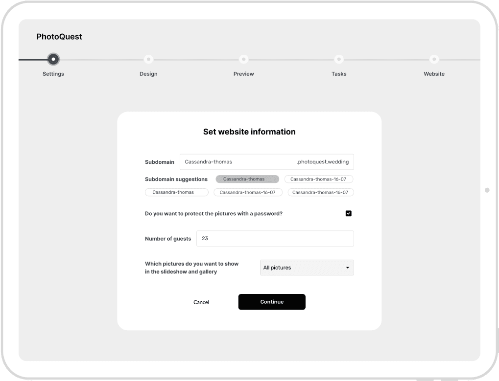
Diving into the design solution, I improved the overall user flow and enhanced the user experience for key features.

1

1

On a higher level, I made three key changes to the user flow to improve the effectiveness of converting users into paid services.

1

a.

a.

a.

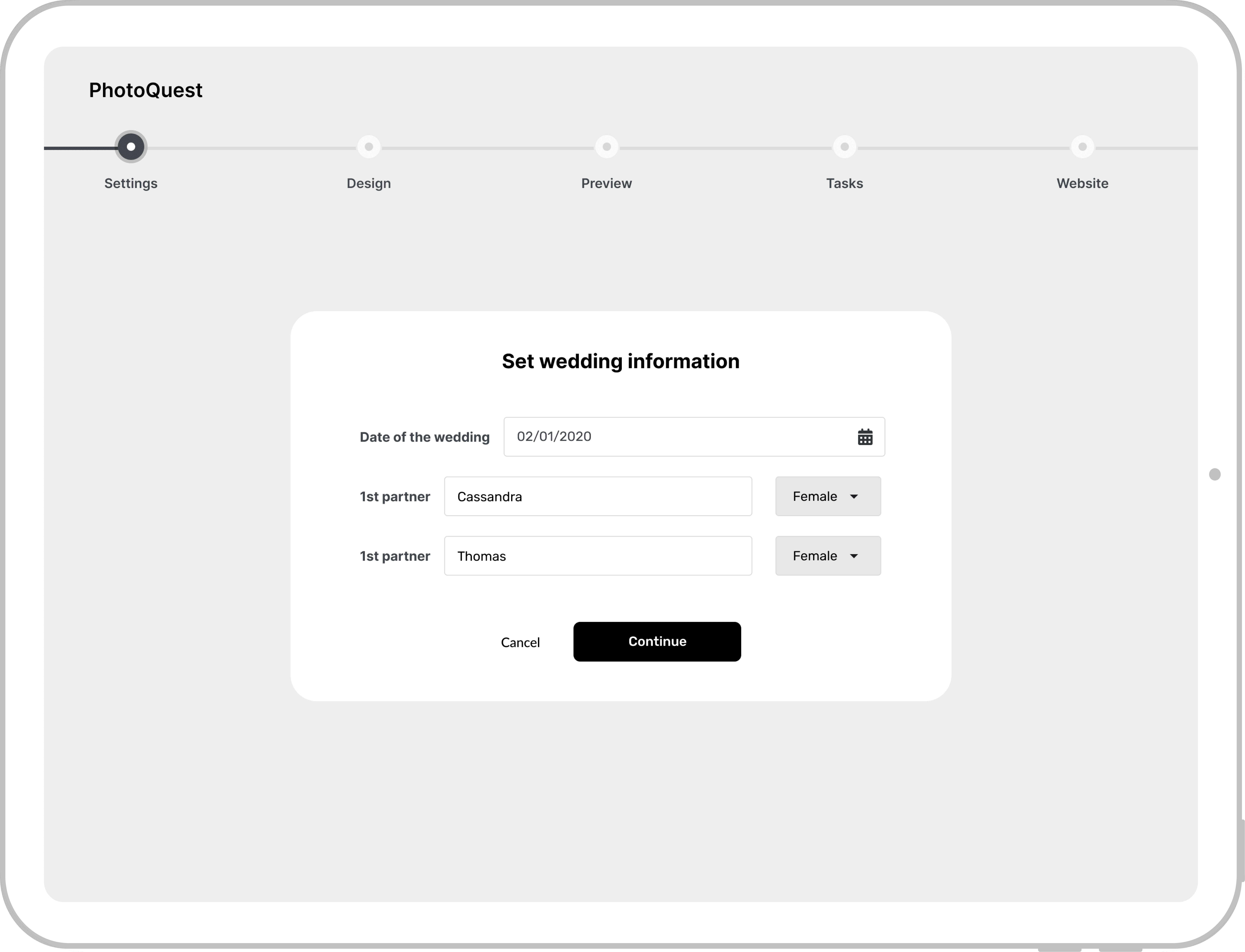
Two-Step Information Entry:

I restructured the initial information collection into two steps to prevent overload and help users understand the purpose of each piece.

b.

b.

b.

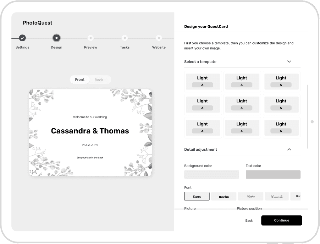
Prioritized Design Card Experience:

I placed the Design Card feature after initial info entry to reduce drop-off rates by engaging users with the core feature earlier.

c.

c.

c.

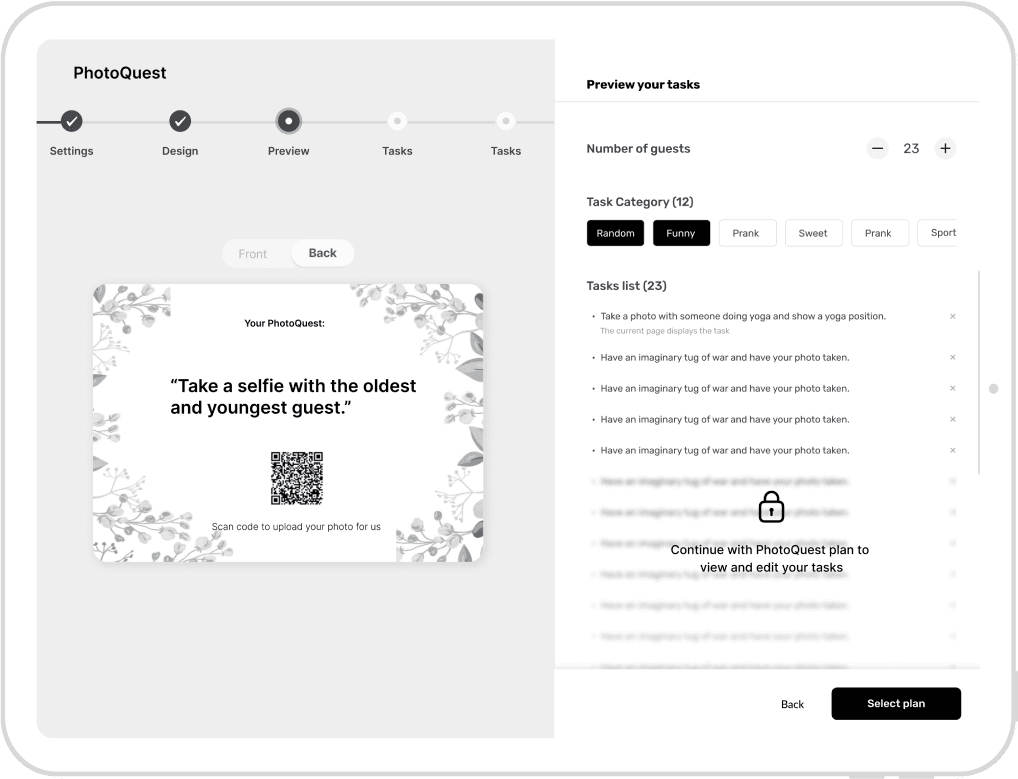
Strategic Placement of Preview Tasks:

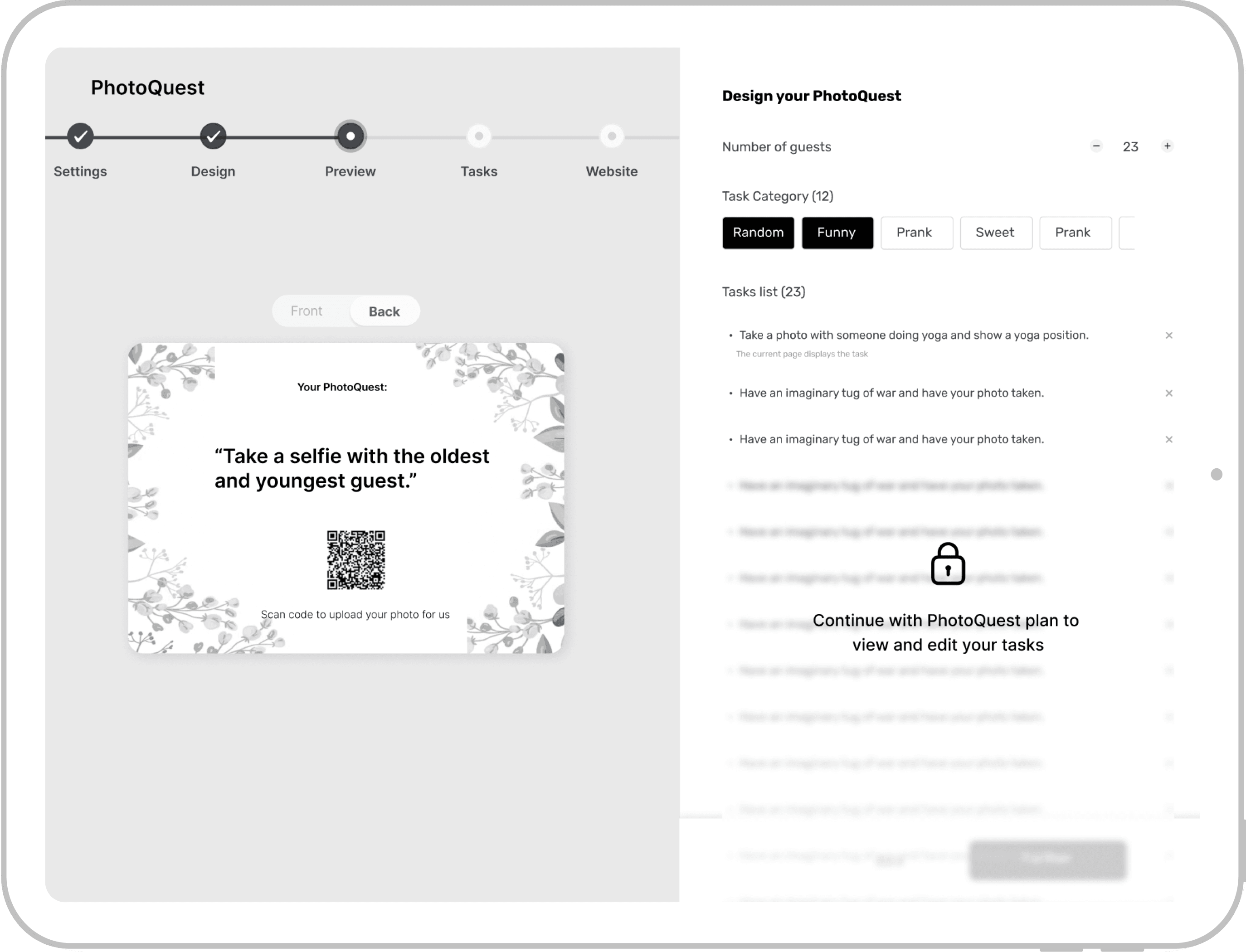
I placed Preview Tasks after the core experience to guide users to the high-value feature behind the paywall.

2

2

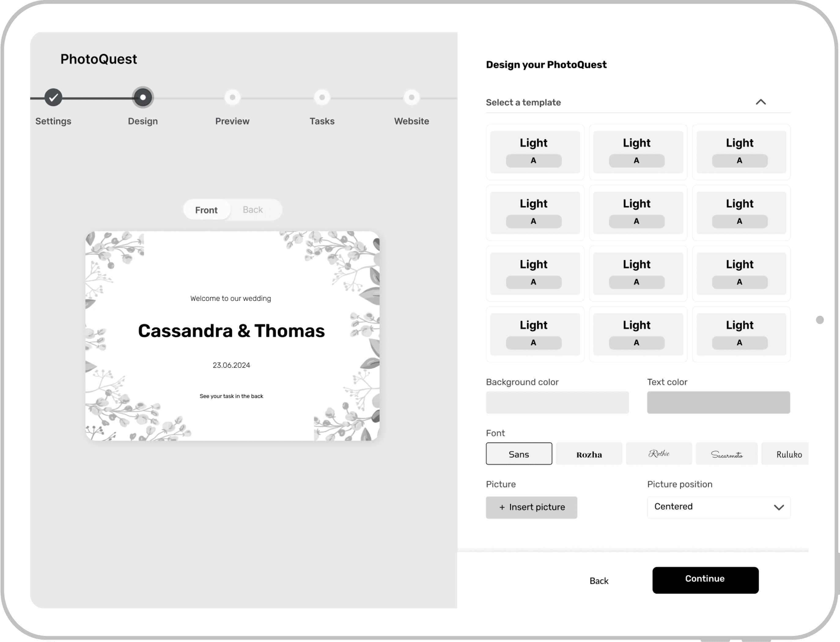
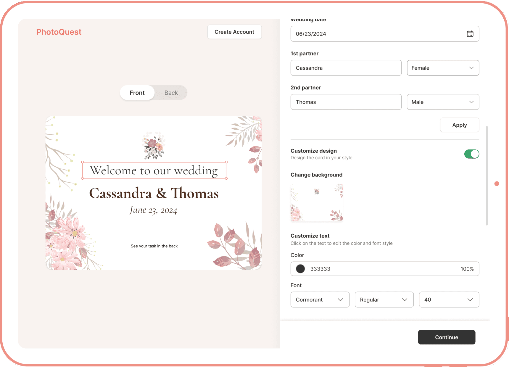
At a detail level, I transitioned the interfaces of the design features from a vertical to a horizontal orientation. This redesigned layout allows users to observe real-time changes to their designs in a side-by-side view.

2

User Testing
User Testing
To evaluate the usability of the first iteration, I designed and conducted a user testing with 9 users, and I did find some issues.
Iteration #2
Iteration #2
Based on the user feedback, I revamped the onboarding experience and resolved the remaining usability issues.

1

1

1

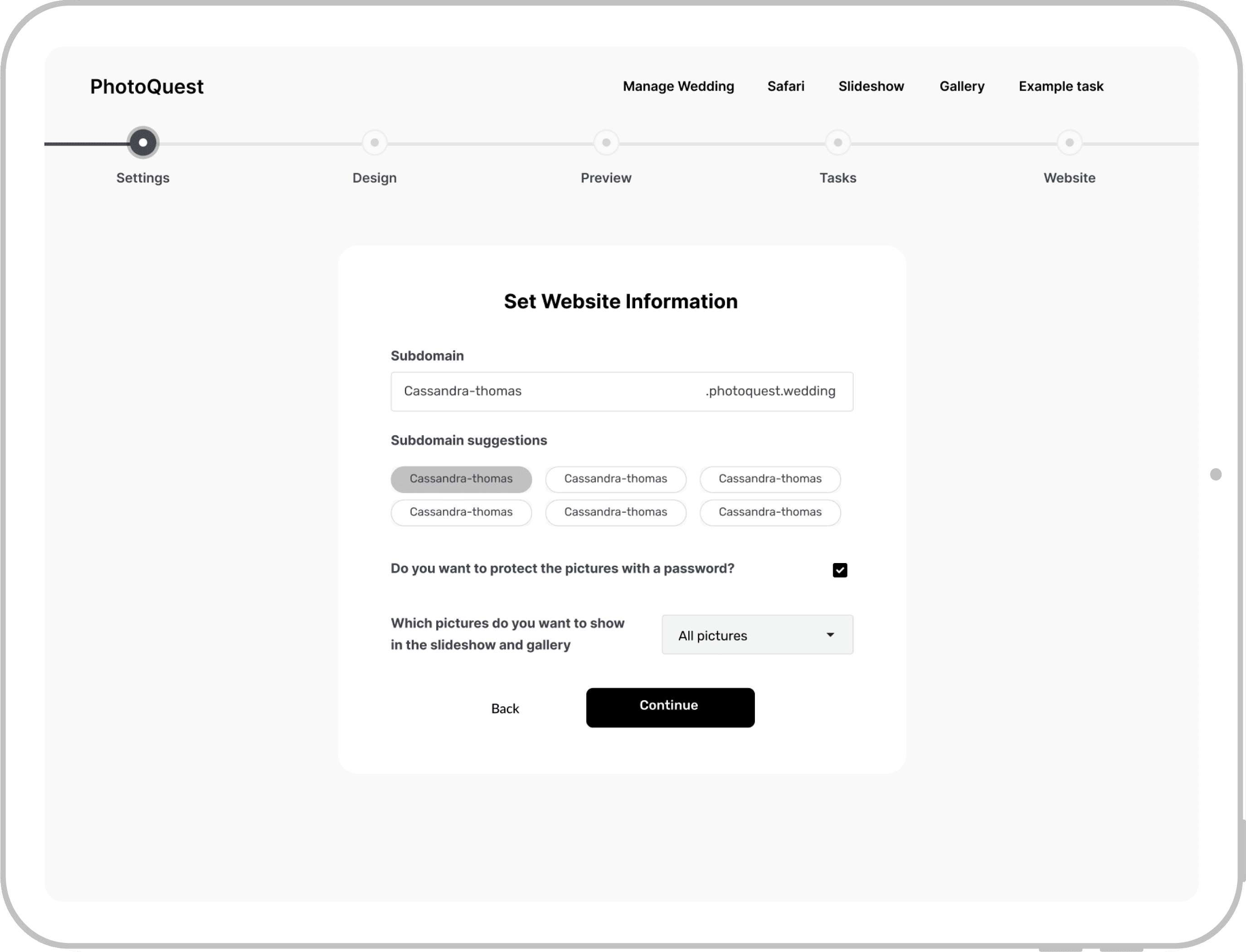
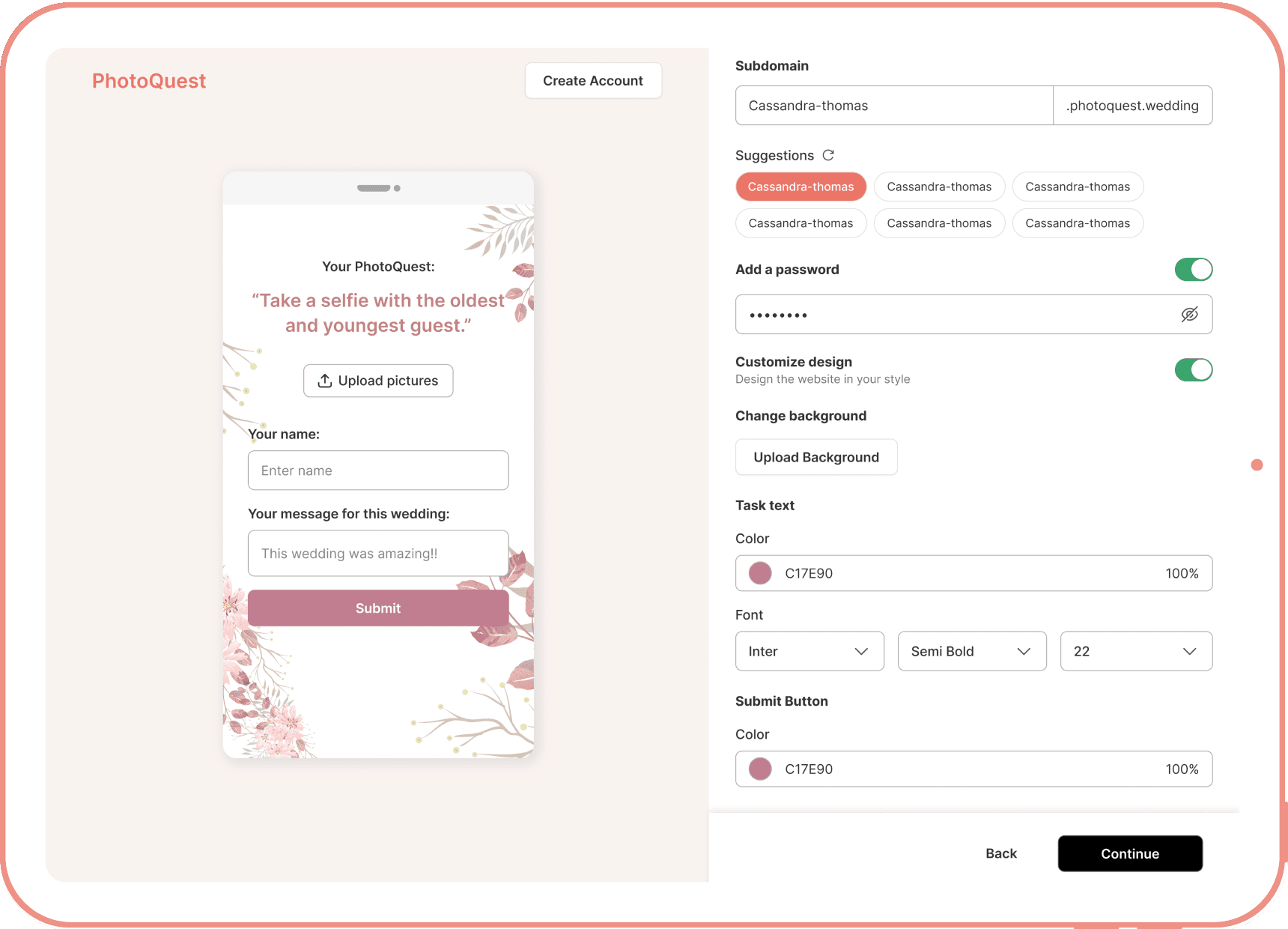
In this iteration, I segmented the information entry into specific steps to help users understand the purpose and use of the required information.

This also allows users to modify the information as needed during the design process without having to return to previous steps.

2

2

2

I also improved the design experience by enabling user to directly manipulate elements on the card they were designing.

This decision not only streamlined user's workflow through intuitive on-page interactions, but also provide a scalable foundation for future feature expansions.

New Challenge
New Challenge
During final design reviews, I initiated another user testing, and uncovered a new problem in the user onboarding funnel.

The user testing revealed that our onboarding process still falls short in illustrating the complete user journey.

Some users still feel unclear about the holistic functionalities, which potentially leading to users' hesitation at the point of purchase by failing to communicate the full product utility.

"How can I trust that the paid PhotoQuest service will meet my needs?"

HMW

HMW

HMW

Clearly communicate the product value
before they decide to begin their experience
Clearly communicate the product value
before they decide to begin their experience
Clearly communicate the product value
before they decide to begin their experience

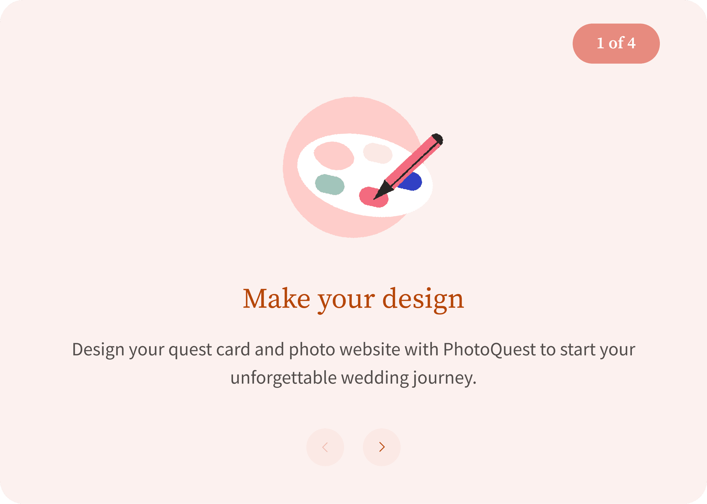
From here, I worked collaboratively with the marketing associate and PM and decided to introduce a brief and effective explainer carousel at the start of the new user onboarding process.

This carousel is designed to visually showcase how PhotoQuest works, providing a contextual introduction to all features and helping users make informed decisions before they begin using the product.

Final Design
In the whole design process, I prioritized close collaboration with the development team to optimize design efficiency and usability.
Experience 1: Design Card
Experience 2: Set Up Tasks
Experience 3: Design Website
Key Takeaways
Key Takeaways

1.

1.

Scalability Matters
Scalability Matters
Scalability Matters

Given that this redesign is for PhotoQuest's MVP, feature expansion is still needed. The design decision made in this project emphasized scalability in early design, and close collaboration with stakeholders ensured solutions met current needs while supporting future growth.

2.

2.

Specification Matters

To better support the development team, I provided clear and detailed specifications that served as a comprehensive guide throughout the project, helping to streamline the development process and ensure a smooth handoff from design to implementation.

3.

3.

Collaboration Matters

During the design process, I collaborated closely with engineers and product managers to explore how we could optimize the core card design experience. As a designer, I bridged the gap between user insights and technical constraints, proposing solutions that were both user-friendly and technically feasible.
Glad you made it to the end :)
See more works!

BlackBird $FLY Shop Design

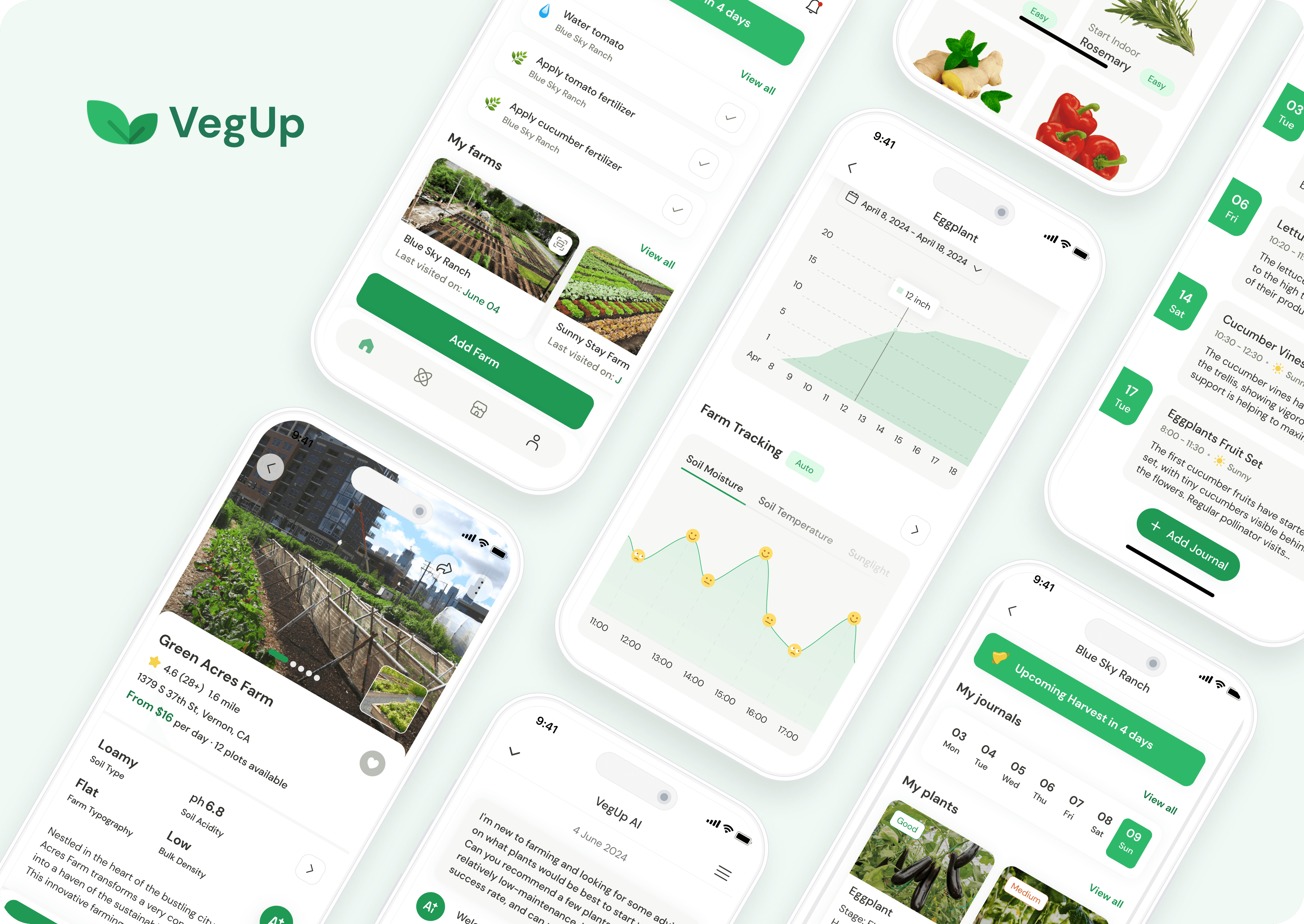
VegUp Product Design

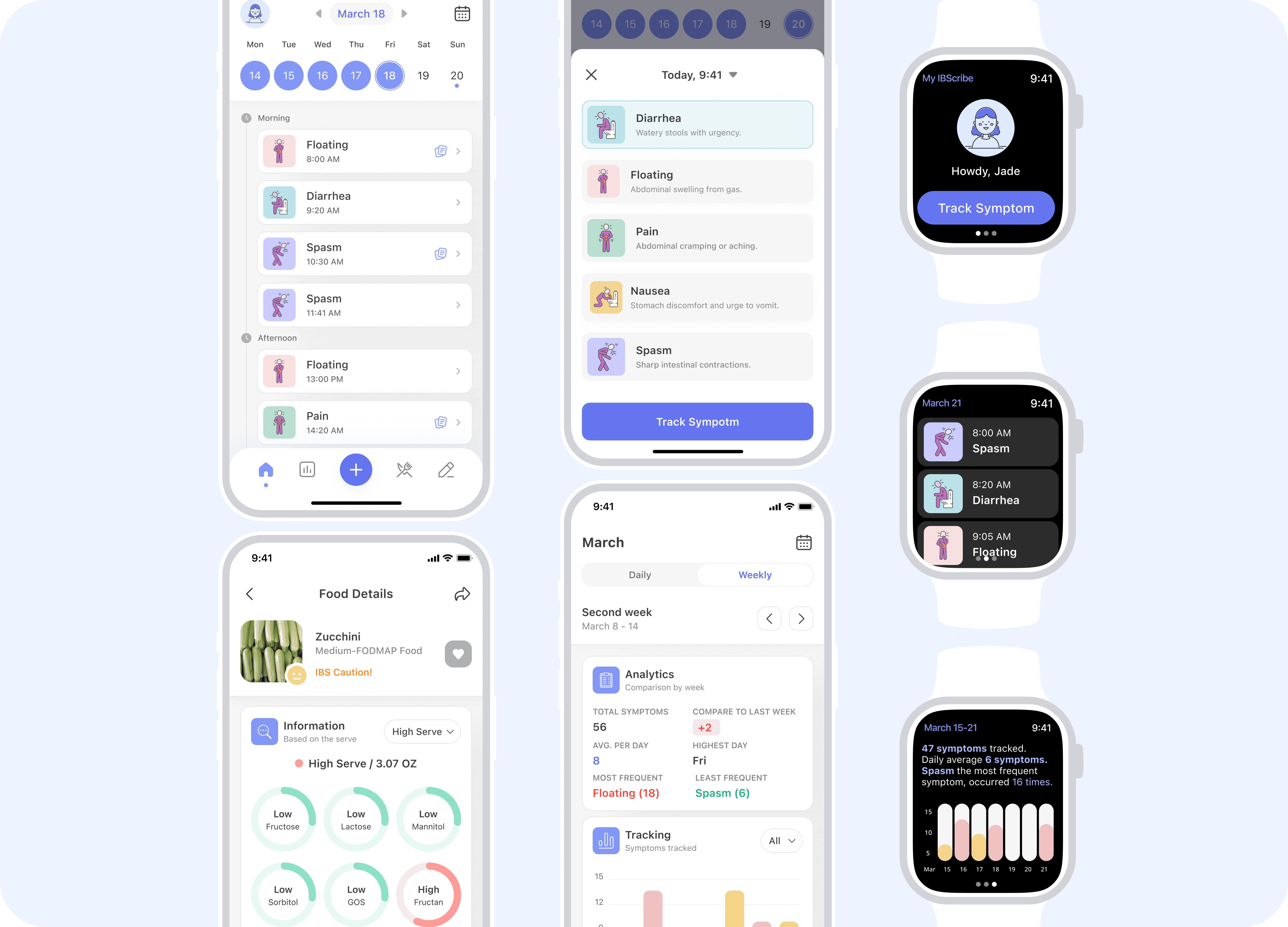
IBScribe Product Design

Glad you made it to the end :)
See more works!

BlackBird $FLY Shop Design

VegUp Product Design

IBScribe Product Design

Glad you made it to the end :)
See more works!

BlackBird $FLY Shop Design

VegUp Product Design

IBScribe Product Design